Readers Question: how to evaluate the reliability of economic data?
This is a good question. In brief, some issues to consider

- Is there a political angle? – Political leanings of media/think tank
- In what context is the data presented? How to interpret the data. Should we look at nominal data, real data or as a percentage of GDP – each stat will give a different impression
- Is the data being used to support a particular opinion? – Is the publisher looking for data to support a particular opinion? For example, if you wanted to be critical of the 1980s, you could find data to show a rapid decline in manufacturing jobs. If you wanted to give a more optimistic impression you could find data on time lost due to strikes/
- Who publishes the data? Do the statistical authorities have independence and a good track record? For example, countries such as Argentina and China have been accused of under-reporting data like inflation for political reasons. UK ONS has reputation for independence.
- How does data compare with other statistics? One example, in the US, there is criticism of the US inflation data (from organisations like “Shadow Stats” arguing the real inflation rate is much higher because the US statistic body ignores changes in quality of products. However, the ‘billion price project’ suggests a very similar inflation rate to the official body. See “A billion prices can’t be wrong” by Tim Harford at the FT
- How is the data collected? Is it from a small survey, which can have sampling errors – or is it a national survey
- How selective is the data? Choosing particular years can give a particular impression. For example, data from the 1950s and 60s, suggests Phillips Curve relationship works. But, if you choose 1970s, the relationship breaks down.
- How to use data? Does an increase in a budget deficit mean the government has failed – or is this a correct response to an economic downturn?
- Who is to credit/blame for the data? US presidents are often judged on economic data – but to what extent are they actually responsible?
Examples
What is included in the data? Recently the UK government made the claim that –
“The UK is the third highest spender on education in the OECD, and that there are 1.9 million more children in ‘good’ and ‘outstanding’ schools now than in 2010.”(1)
This is a statistic used by the government to reject claims of ‘cuts’ in spending. However, critics argue that the data is misleading because in this statistic it includes private spending on tuition fees and universities. Therefore, at best the statistic is a misleading guide to public spending on secondary school
According to Schools Week – it re-ran data on the OECD website so only public expenditure on education as a percentage of GDP was counted across all countries. On this metric, The UK tumbled from third place to 15 for expenditure on education as a percentage of GDP, out of the 36 member countries.
Spending per capita
Another issue is that the government points out higher education spending and higher numbers in good school. However, the UK is also experiencing population growth. Nominal increases in spending are misleading if we exclude the number of students involved. A more useful statistic is to measure spending per pupil – as this statistic translates better into education resources per pupil.
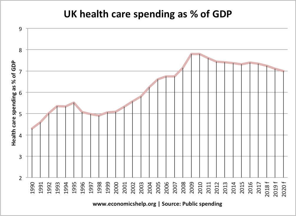
Similarly, spending on heatlh care is subject to similar uncertainties.
Real spending on health care has increased, but as a percentage of GDP, it has fallen.
Worst level of UK debt on record

This graph shows the total level of UK government borrowing. It shows a rapid increase since 2002. It is true that the latest figures show a record level of total UK debt. However, at best, it is a misleading figure. Total debt levels need context. What percentage of GDP? What percentage of tax revenues. If GDP rises at the same rate as total debt, the debt is manageable.

This may seem like a record level of debt as % of GDP, but it is also useful to put in a historical context.

In this context, the rise in debt as a % of GDP looks less dramatic.
Another issue is how should data be used? A newspaper may report rising debt levels with the assumption this a ‘bad thing’ – but from a Keynesian perspective, a rise in government debt during a recession would be seen as a necessary or even beneficial response to the recession.
Data in isolation
One-quarter of economic growth is always an unreliable guide to judge economic performance.

Related