I’ve just got back from my Christmas holidays. I spent two weeks in Croatia (the EU’s newest member, 2013). It was very beautiful by the coast, if somewhat cold.

Just like students find it hard to write the first essay after a three week holiday, I also struggle to get into the flow of economics after a long break.
To help ease back into the flow, I shall borrow a couple of graphs from the internet
A graph tells us a lot, but can also open up many questions.
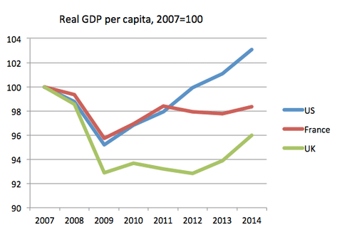
Firstly economic growth in UK compared to France and the US

Via P. Krugman and How good has UK recovery been? at Mainly Macro.
See also UK vs France recovery from Jan 2015.
Good recovery in the past 12 months, but since 2007, UK recovery looks less spectacular. Also, note this graph is GDP per capita – the UK population has been rising, which makes GDP per capita less impressive than raw real GDP.
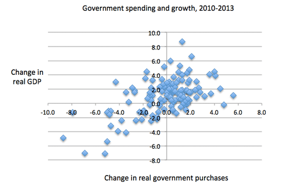
Also record of austerity

Austerity record, Krugman.
More blogs in the coming days. Questions welcome as usual

I am struggling to find where you got the data from to create the first figure comparing the economic recovery of the UK to France and US. The links provided take me to a page that does not exist and the other to a page that provides neither figures of a similar nature to the graph nor is it even written by the same author! Can you give me some better references as to where this graph has come from?
Sorry, I wrote post in 2015, so links may be dead by now. You can try this link (behind paywall now) https://krugman.blogs.nytimes.com/2015/01/02/britains-success-story/