
- Total Fixed Cost (TFC) – costs independent of output, e.g. paying for factory
- Marginal cost (MC) – the cost of producing an extra unit of output.
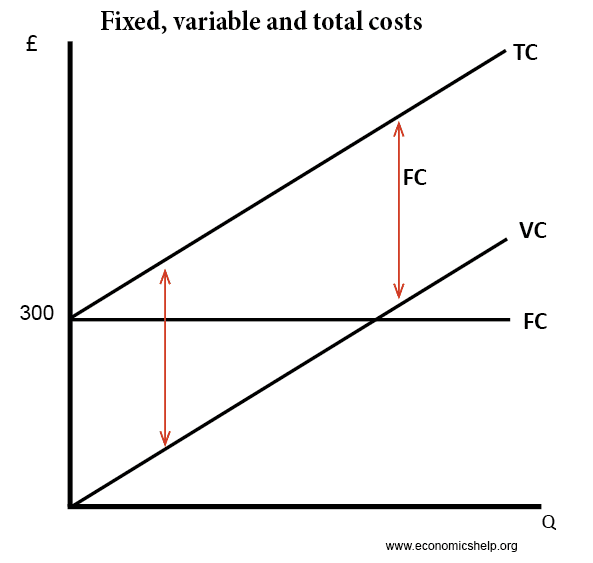
- Total variable cost (TVC) = cost involved in producing more units, which in this case is the cost of employing workers.
- Average Variable Cost AVC = Total variable cost / quantity produced
- Total cost TC = Total variable cost (VC) + total fixed cost (FC)
- Average Total Cost ATC = Total cost / quantity
Costs in the short run
Short run cost curves tend to be U shaped because of diminishing returns.
In the short run, capital is fixed. After a certain point, increasing extra workers leads to declining productivity. Therefore, as you employ more workers the marginal cost increases.
Diagram of Marginal Cost
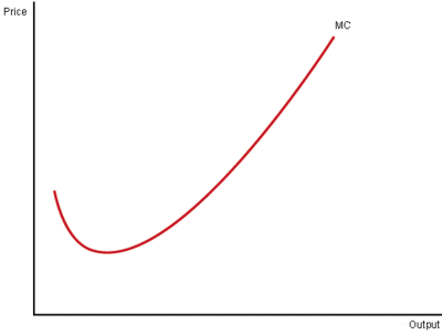
Because the short run marginal cost curve is sloped like this, mathematically the average cost curve will be U shaped. Initially, average costs fall. But, when marginal cost is above the average cost, then average cost starts to rise.
Marginal cost always passes through the lowest point of the average cost curve.
Average Cost Curves
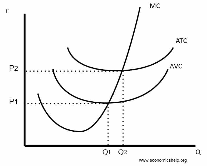
- ATC (Average Total Cost) = Total Cost / quantity
- AVC (Average Variable Cost) = Variable cost / Quantity
- AFC (Average Fixed Cost) = Fixed cost / Quantity
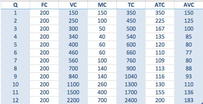
Costs
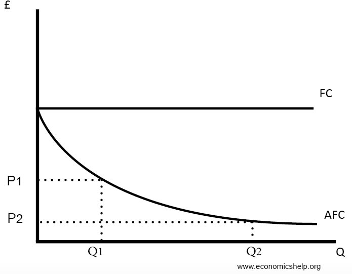
- Fixed costs (FC) remain constant. Therefore the more you produce, the lower the average fixed costs will be.
- To work out the marginal cost, you just see how much TC has increased by.
- For example, the third unit sees TC increase from 450 to 500, therefore, the increase in MC is 50.
- The 12th unit sees total cost rise from 1,700 to 2,400, so the marginal cost is 700
Average fixed costs
Fixed, variable and total cost curves
Long Run Cost Curves
The long-run cost curves are u shaped for different reasons. It is due to economies of scale and diseconomies of scale. If a firm has high fixed costs, increasing output will lead to lower average costs.
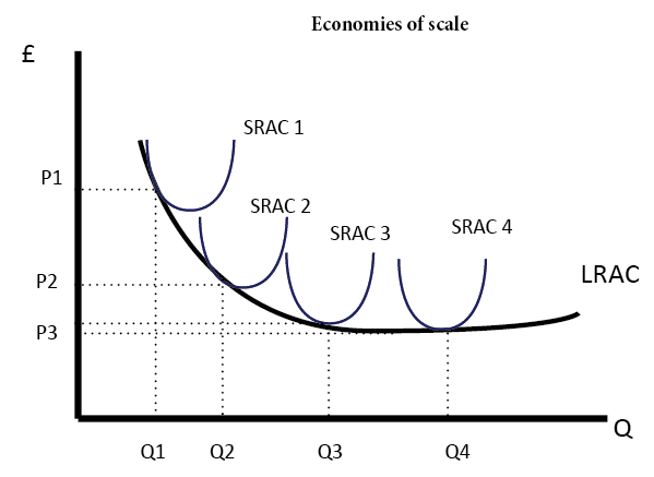
However, after a certain output, a firm may experience diseconomies of scale. This occurs where increased output leads to higher average costs. For example, in a big firm, it is more difficult to communicate and coordinate workers.
Diagram for Economies and Diseconomies of Scale
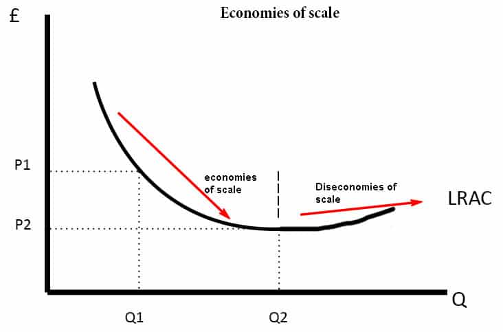
Note, however, not all firms will experience diseconomies of scale. It is possible the LRAC could just be downward sloping.

Related
- Diagram of Monopoly
- Diagram of Perfect competition
Marginal fixed cost is the total fixed cost at one unit of output and is nil for all higher units of output. Average fixed cost is also the total fixed cost at one unit of output but declines in the form of a hyperbola for all higher units of output. Marginal variable costs are the same as average variable costs. Cost accountants have been quicker than economists to recognise this. The U shaped cost curve with its declining marginal curve is economically unrealistic as well as being superfluous. All these marginal and average curves can be shown on the same coordinates diagram.
Thanks pete!
these diagram cleared all of my doubts in short run& in long run
yaaah simplified diagrams
I understood the Cost Curves better after reading this article .Keep up the good work ; From Kenya
kindly help with:
show how diminishing marginal physical product id related to the shape of short-run marginal and average cost curves
That’s correct
great and helpful…..but was confused on which diagram to use in answering my question….the section of a firms short-run marginal cost curve above the average cost curve is taken as its supply curve; show the validity of this statement in a diagram
thank for the clear explanation and diagrammatic expression of costs.
Thanks for clear explanation of the types of cost from Ghana
what a great and simple explanation of the cost and its types and curves
After going true the note I now understand it better then before,keep the good work
Thanks for graphics explanation, have acquire a lot.
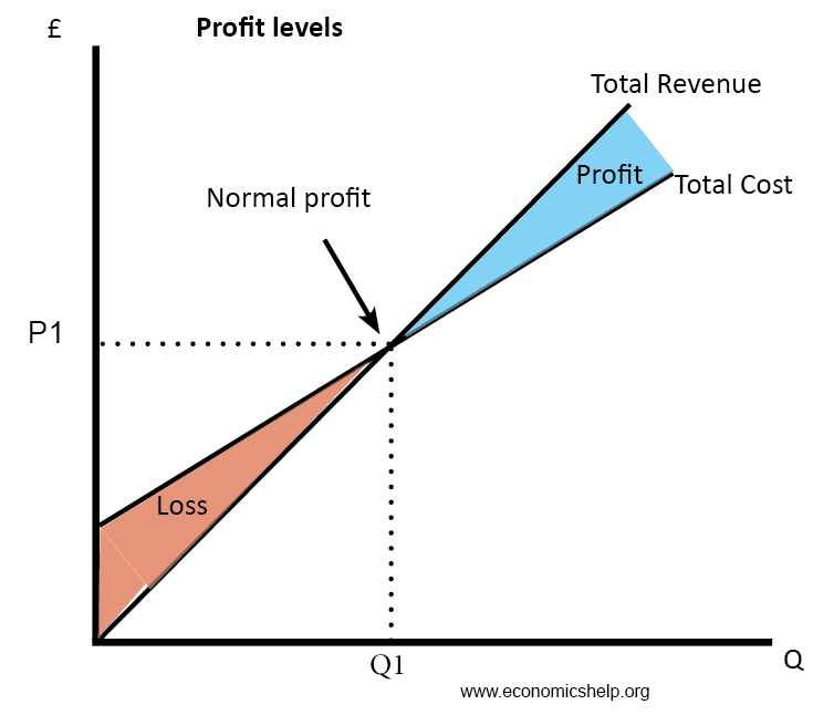
the profit maximising monopoly would produce at the profit maximising quantity Q1 where mc = mr (1link) and charge a price of P1. This would limit some people from having access to the good(1link). They are able to charge at a price P1 because they could be a main supplier of a unique good(1link) or there could be high barriers to entry such as intellectual property rights(1link), and exit such as expensive marketing campaigns (1link) which means there is no threat of new entrants. Here the firm would be making super normal profit P1-C1 x Q1 (1link). this is profit over and above normal profit where AR>AC(1link).
At least now I understand cost theory has different aspects: total cost, fixed cost, and variable cost. In which Variable cost changes as the output changes, fixed cost remains constant as the output increase. Total cost is the total amount spent on fixed and variable inputs to produce outputs
we also have;
average fixed cost
average total cost
Averavariable
Helpful presentation,however can you please elaborate further on the Total cost curve explaining what certain points represent.n
Thanks a lot for this, really useful!