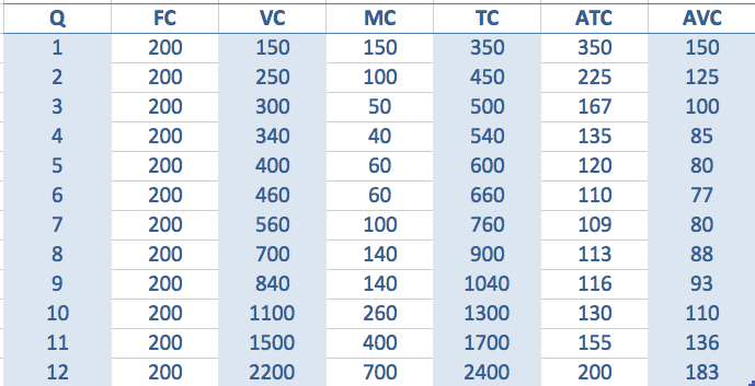
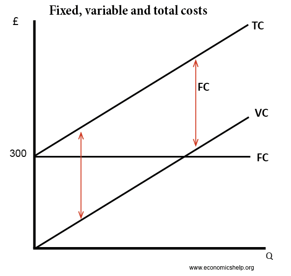
- Total Fixed Cost (TFC) – costs independent of output, e.g. paying for factory
- Marginal cost (MC) – the cost of producing an extra unit of output.
- Total variable cost (TVC) = cost involved in producing more units, which in this case is the cost of employing workers.
- Average Variable Cost AVC = Total variable cost / quantity produced
- Total cost TC = Total variable cost (VC) + total fixed cost (FC)
- Average Total Cost ATC = Total cost / quantity
Costs in the short run
Short run cost curves tend to be U shaped because of diminishing returns.
In the short run, capital is fixed. After a certain point, increasing extra workers leads to declining productivity. Therefore, as you employ more workers the marginal cost increases.
Diagram of Marginal Cost
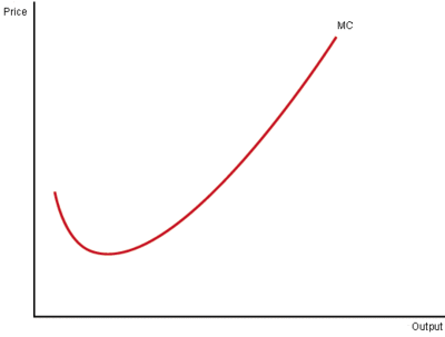
Because the short run marginal cost curve is sloped like this, mathematically the average cost curve will be U shaped. Initially, average costs fall. But, when marginal cost is above the average cost, then average cost starts to rise.
Marginal cost always passes through the lowest point of the average cost curve.
Average Cost Curves
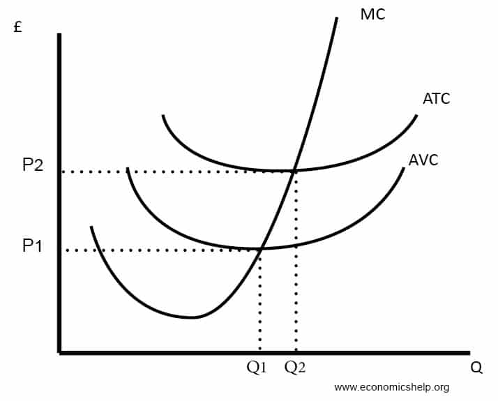
- ATC (Average Total Cost) = Total Cost / quantity
- AVC (Average Variable Cost) = Variable cost / Quantity
- AFC (Average Fixed Cost) = Fixed cost / Quantity
Costs
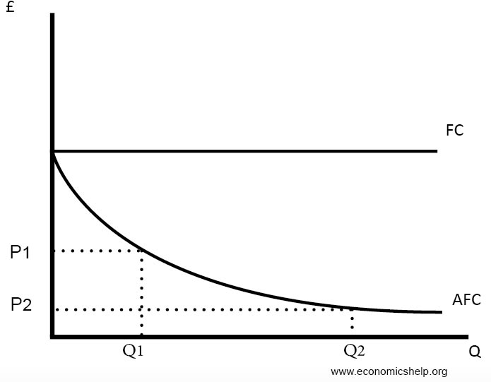
- Fixed costs (FC) remain constant. Therefore the more you produce, the lower the average fixed costs will be.
- To work out the marginal cost, you just see how much TC has increased by.
- For example, the third unit sees TC increase from 450 to 500, therefore, the increase in MC is 50.
- The 12th unit sees total cost rise from 1,700 to 2,400, so the marginal cost is 700
Average fixed costs
Fixed, variable and total cost curves
Long Run Cost Curves
The long-run cost curves are u shaped for different reasons. It is due to economies of scale and diseconomies of scale. If a firm has high fixed costs, increasing output will lead to lower average costs.
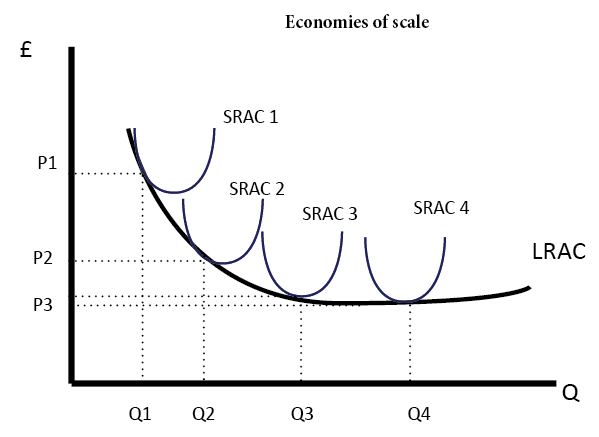
However, after a certain output, a firm may experience diseconomies of scale. This occurs where increased output leads to higher average costs. For example, in a big firm, it is more difficult to communicate and coordinate workers.
Diagram for Economies and Diseconomies of Scale
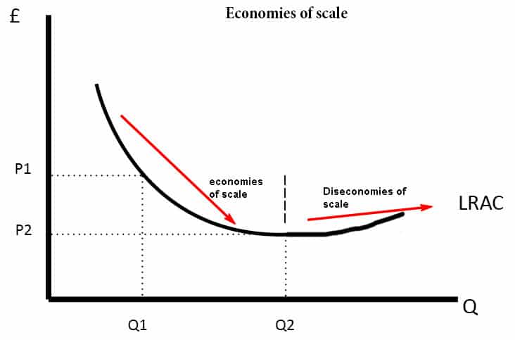
Note, however, not all firms will experience diseconomies of scale. It is possible the LRAC could just be downward sloping.

Related
- Diagram of Monopoly
- Diagram of Perfect competition
examples was very good.
i also like the definitions.
thanks
VERY GOOD DEFINITION IN THE FEWEST WORDS.
to the point answer.
very nice i likeeee how muuuuuch????
are those the onli cost curves, are there more cost curves and can u describe them plz
thanks it really useful information
i like the brief notes
Am really looking for a place to develop and advance my career as an Economist
very brief and to the point definition I like it.
Thanks
i like this define
thanks for simplified explanation
Great website but Can you please mark contents with as and a2 level
That was super intelligence that I’ve just discovered, thanks to these points I now understand cost curves