Cherry picking of data means we look for particular data and statistics that help to illustrate our point of view. It can also mean we present data in a certain way which is more favourable to creating the impression we want. Even the same statistic can be presented in different ways to give a very different impression.
How to portray the recent record of the UK government?
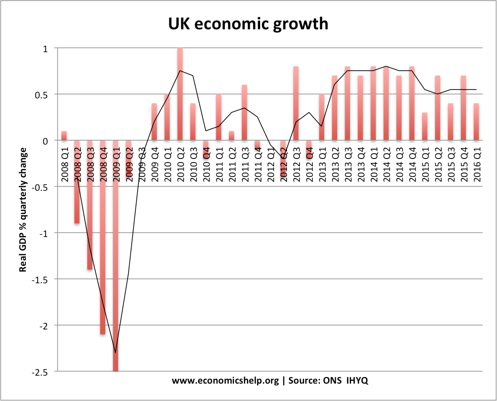
- Since 2013, the UK has one of fastest growth rates in Europe, averaging close to the UK’s long run average trend rate of 2.5%
- Since 2008, we have seen the slowest recovery since South Sea Bubble of Eighteenth Century in 1720. – D.Blanchflower has made point UK has had slowest recovery for 300 years. See: slowest recovery
Both are potential headlines for the same basic statistic of the UK’s recent economic growth, but they give very different impressions.
It is quite easy to cherry pick data. For example, comparing the economic record of Cameron and Osborne 2010-16, we could choose different statistics.
Real GDP
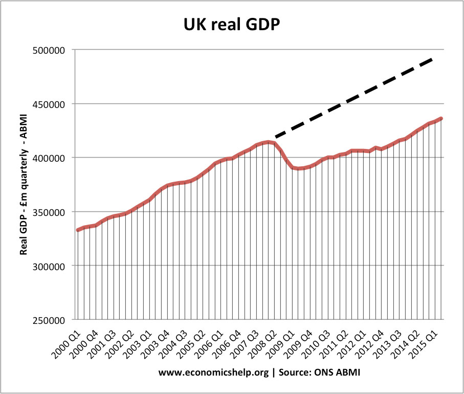
Real GDP growth shows better recovery since 2013.
Real GDP per capita
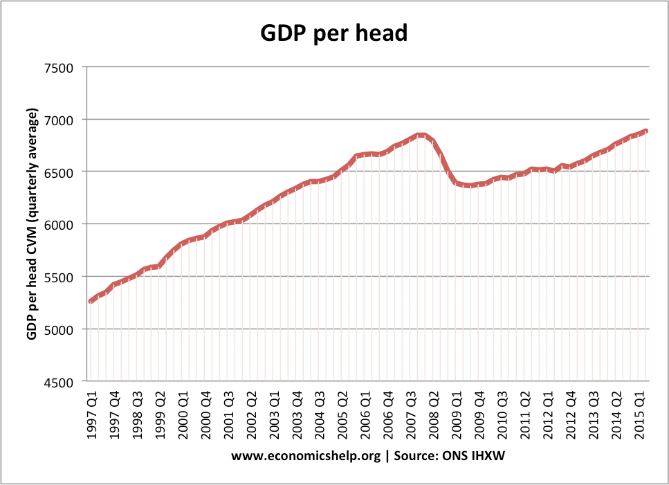
Real GDP per capita = real GDP/population. Since UK population has been rising, the growth in real GDP per capita has been slower than real GDP.
If we look at economic growth per person, the results of economic growth is less successful. This is one reason why people can feel that economic growth doesn’t translate into better living standards.
Real disposable income per head
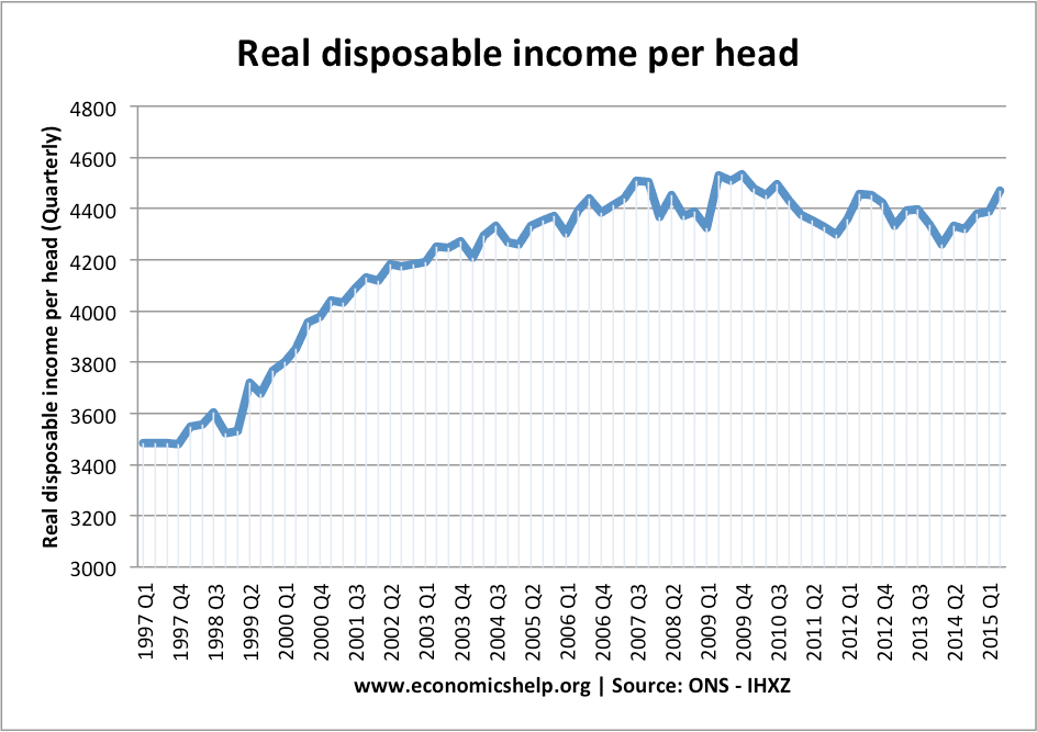
Using real disposable income per head shows a different situation to economic growth and real GDP per capita. Real disposable income shows the average wage income after tax and benefits have been applied. Real disposable income per capita is lower than real GDP per capita because higher GDP hasn’t always translated into higher wages, e.g. the economy has seen a higher proportion of profit for firms.
It shows why there can be a gap between economic growth statistics and perceptions of what people feel is happening to the economy.
Slowest recovery on record
The UK has had decent economic growth, but if we compare to previous recessions, this has been one of the slowest recoveries on record. There is still potential GDP lost from inadequate growth.
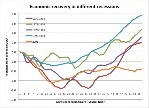
Of course, if you’re evaluating the government of 2010-16, this is a little cheeky to start using figures before they came to power 2008-10, you can’t blame the Conservative government for economic record before they came to power.
Unemployment
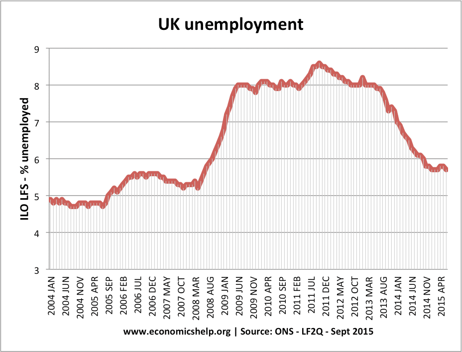
One of the strongest successes of the Conservative administration 2010-16 has been the fall in unemployment.
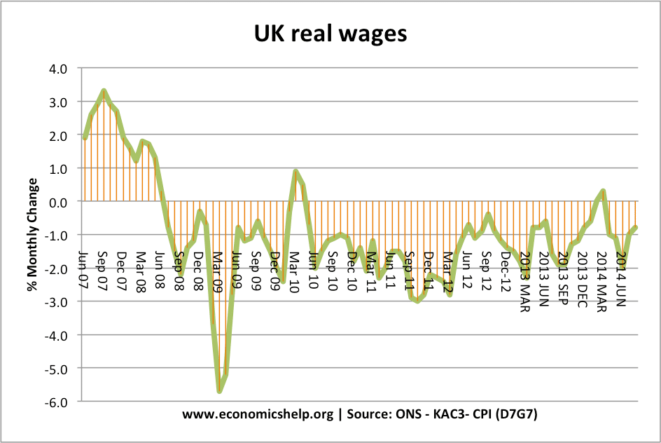
If you wanted to be more critical of the Conservative administration, you would highlight real wages, which suggests the fall in unemployment has been partly due to growth in low wage jobs.
Debt crisis?
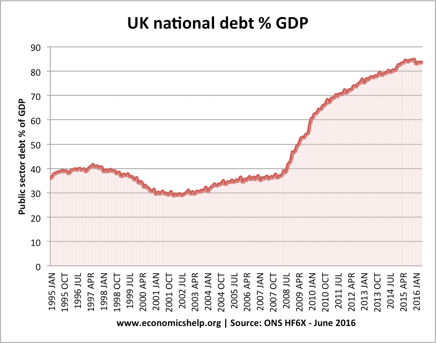
If you wanted to give impression of a debt crisis, you could post a graph like this which shows public sector debt as a % of GDP has nearly tripled since 2002. If you wanted to have a more dramatic graph, you could post the total level of debt, which has increased even faster that debt to GDP. e.g. the popular debt clocks which show ever rising debt levels.
However, if you wanted to place the growth in real debt to GDP in a different context, you could show debt to GDP since 1900.
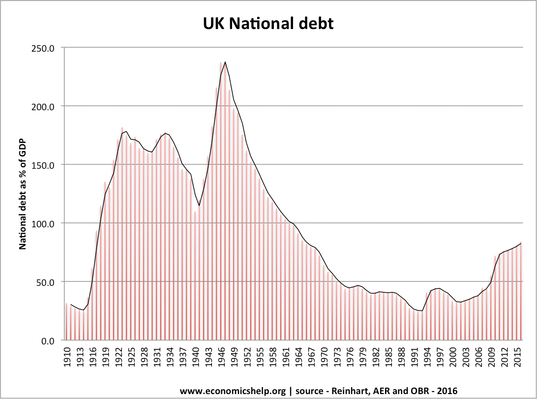
From this perspective, the rise in public sector debt as a % of GDP looks quite mild. The 1950s – the period of highest debt levels were consistent with good growth prospects.
Decline in increase
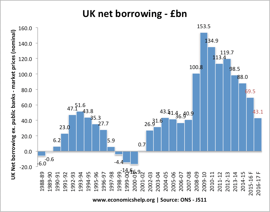
Another way to portray the state of public finances is to identify the decline in annual borrowing. The fall in annual borrowing, means debt is rising at a slower rate.
Choosing years to make your point
Another habit that can be quite frustrating is people make generalisations based on a co-incidence of data. For example, you could look at the above graph and say.
- Record debt levels in the 1950s, show that having very high government debt levels is no barrier to fast rates of economic growth.
- The rise in government debt levels since 2008 have corresponded with the slowest economic recovery on record. Therefore debt is a constraint on growth.
Both statements are, at best, very limited. We can’t say high debt leads to high growth any more than we can say rising debt leads to low growth.
Evaluation
As an economist I’m always wary of judging economic competence of a government on economic statistics. To some extent the government’s record depends on external factors beyond their control. The fall in GDP in 2008 recession was seen across the globe. In recent years, economic growth rates are lower than in the ‘golden age’ of the post-war boom. The real question is – was government policy optimal for the economic situation?
Cherry picking of Post-Brexit data
Since the Brexit decision there has been a fevered examination of any economic statistics to indicate whether the UK is heading for recession. I saw a headline in Times this week ‘Business as usual’. On the same day, the Financial Times, highlighted some negative news from the very same report ‘Increase in uncertainty’. We are likely to see a lot more of this over the next few months.
Related
(to Tejvan). Thank you for your post. I am looking forward your update when post Brexit data would become usable!
I would be pleased to share some examples of naive (rather than deliberate) cherry-picking, or similar biases (e.g.: French survey on “PhD brain drain”, or PISA data). I am a computer scientist, not economist, and I would like to draw if some “use patterns” could be linked with data types (ex.: NOIR measurement levels), in order to write software alerts (?).