There are many ways for statistics to be misleading. Firstly, governments can just outright lie and make up their own statistics. When inflation was too high in Argentina, the government ordered the statistics agency to reduce the inflation rate. Problem solved. In Soviet times, local officials would fall over themselves to produce statistics that iron production had once again quadrupled in the past five years. When Chinese youth unemployment was uncomfortably high, they just stopped producing the statistic.

I find the ONS is generally quite good, but not immune from problems. I reported on the massive increase in people not working, which looked a really interesting, almost shocking statistic. But, later I found it was probably just due to dodgy data.

The Resolution Foundation argued it was wrong. Not this is not a conspiracy just incompetence. To produce this data they rely on surveys, but after Covid the response rate was only 17%, making many labour market stats basically unreliable.

Shadowstats claims US data on inflation is wrong because in 1980, they changed their methodology. It is true in 1980, the bureau of labour did change their methodolgy and they say it made inflation 0.45% per year lower. But, if you look into shadowstats, they don’t use the old methodology they just use a fudge factor. Making inflation permanently 5-6% a year higher than official method. This is a false statistics. By the way, it is hard to fudge inflation data whether you are the government or private body, because these days there are things like “billion price projects” which can check the online prices across the world and come up with independent measures. But Inflation is one statistic where there is the most scepticism There’s a huge market for inflation truthers. At least in part because there are different ways to calculate it. In the UK service sector inflation and OOH is currently much higher than headline rate. Owner Occupier Housing cost is currently 8%. But, what I want to really talk about today is the selective use of statistics to prove a particular point. It is particularly apt for a media framework which can reward you for producing content which pushes a certain narrative.
UK economy doing well?
So I’d like to try do something a little different, can we use statistics to show the UK economy is doing fantastically well – bear with me for one minute and see how convincing it is.

In the past few decades, the UK economy has tripled in size, giving average households significantly higher average incomes. In 1955, GDP per capita was £10,000, today it is £30,000. The past century has also seen a radical decline in wealth inequality. In 1902, the top 10% owned 92% of the nations wealth. Today it is 58%. In the past 23 years, we have also seen a significant fall in income inequality. Some claim housing is too expensive. But, since 2009, real house prices have fallen by 20% and since the early 1990s, the percentage of income that young people spend on housing has stayed constant at around 30%. Not only that, but the UK has made tremendous progress in reducing the unemployment rate.

In the 1980s, unemployment averaged over 10%, today it is close to full employment at 4.4%. The rise in GDP and strong economic performance means that the UK has had the fastest growth of any European G7 nation since 2010. It has enabled the UK to spend more on health care. In 1990, we spent just £700 per person on health care. In 2024, that is closer to £3,000 and those are real figures, adjusted for inflation.

As well as more spending on health care, we have seen a dramatic increase in the numbers attending university. I could go on, but you get the idea. By the way none of this is using tricks like focusing on nominal increases. It’s just a presentation to try and present the economy in a certain light. But, let us take a closer look.
Firstly, no one is going to argue that life is much better than 100 years ago. If you get made unemployed today you don’t end up in the workhouse. But, comparing the past 100 years is really unhelpful to what is happening in recent years.

If we take the same GDP per capita trend, the important thing is that growth has fallen way from its trend growth. If we had stayed on this past trend, we would be £8,000 a year better off. If you zoom in to recent years, it looks worse, and in fact, GDP per capita is lower than 2019.

It’s the same with wealth inequality. 1900 was a time of Lords of the manor, the aristocracy in ascendency, doffing your cap to your superiors a Downton Abbey kind of world. The more pressing thing is the rise in inequality in recent years, especially because many without wealth have seen income stagnation and rising housing costs. Also, in this case, there is evidence, the rich are better able to hide part of their wealth in offshore accounts, something this data misses. The HM Treasury stat about fastest growth in European G7 is not particularly impressive when you look at GDP per capita growth. UK growth since 2010 has been boosted by higher population.
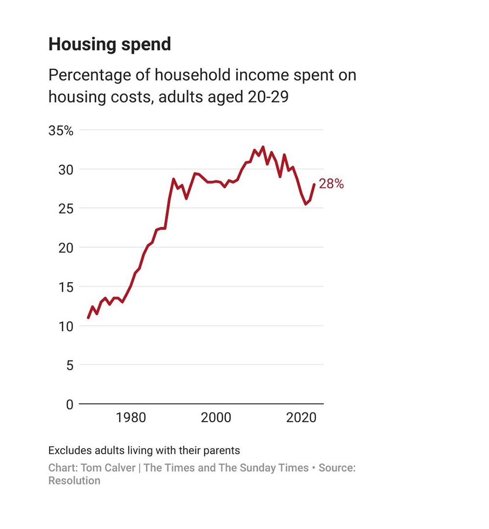
What about the statistics that young people spend 30% of their income on housing. This is a classic example, of a statistic only showing part of the story. What’s happening is more complex.

Basically, 30% of income on rent is a kind of maximum that people can afford. As rents and house prices increase, young people have had to accepted smaller house sizes or live with more people. Private renters, Under 45 have less space than in the 1990s.

Also, in the 1990s, young people might be spending 30% of income on a mortgage, an investment for old age. Today, they are spending 30% on a cramped 5 person house share, and maybe have to commute further to work. It is true real house prices have fallen, but compared to incomes, house prices are close to the highest ever level. A fall in real house prices hasn’t made it any easier to buy.
True we spend more on health care person than ever before, but we also have close to record waiting lists. Arguably what you care about is not how much is government spending, but how long does it take to get treated.
https://www.bloomberg.com/news/articles/2023-08-16/china-is-hiding-more-and-more-data-from-the-rest-of-the-world
A great piece. This is exactly the type of discussion we should have about the usefulness & partial nature of statistics & how they never speak for themselves. One big caveat, if we took a longer view of all of the stats, say 100 years it would question the more radical point that capitalism fails to deliver for most people-in the west. And that despite the recent blood you correctly highlight, do people, in historical comparison, really have much to complain about? One way of measuring’ or registering complaints is strike stats. And strikes have pretty much collapsed over the last 40 years. This is something I am grappling with.