Aggregate Demand is the total demand in the economy.
AD = C + I + G + (X-M)
- C= Consumer spending (Household consumption)
- I = Investment (gross fixed capital formation)
- G= Government spending (Government investment and Government consumption)
- X-M = Net Exports (exports – imports).

Components of Aggregate Demand

A graph showing components of AD as a %
- Household consumption is the largest component at 61%
- Government spending is 23%
- Investment 15%
- Net exports – 1% (current account deficit)
In the above charts, I left out 2 minor factors NPISH and change in inventories to make it simpler.
| TABLE 3 – UK GDP | ||||||||
| COMPONENTS OF DEMAND – £bn, 2006 prices | ||||||||
| Final consumption expenditure | Change in inventories | |||||||
| HH | NPISH | Government | GFCF | Exports | Imports | Real GDP | ||
| ABJR | HAYO | NMRY | NPQT | CAFU | IKBK | IKBL | ABMI | |
| 2007 | 890.9 | 36.6 | 310.6 | 253.6 | 7.8 | 417.5 | 467.6 | 1449.9 |
| 2008 | 878.0 | 35.8 | 315.6 | 241.4 | 1.7 | 422.9 | 462.0 | 1433.9 |
| 2009 | 847.0 | 34.5 | 315.4 | 209.1 | -12.5 | 382.9 | 405.5 | 1371.2 |
| 2010 | 857.4 | 34.9 | 320.1 | 215.6 | 4.9 | 411.1 | 440.4 | 1399.9 |
| 2011 | 850.6 | 34.1 | 320.3 | 213.0 | 5.6 | 430.0 | 445.7 | 1409.0 |
Source: HM Treasury Data
Aggregate Demand curve
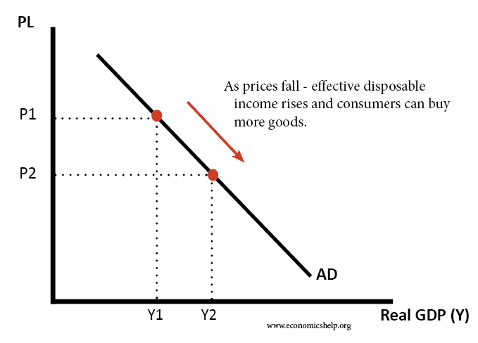
AD slopes downwards because:
- At a lower price level, people are able to consume more goods and services, because their real income is higher.
- At a lower price level, interest rates usually fall causing increased spending.
- At a lower price level, exports are relatively more competitive than imports.
Related
where is the pie chart from ONS 2012 from? Please can you cite it or post a link?