The basket of goods reflects the most commonly bought goods in an economy. When calculating inflation, statisticians check these 1,000 most commonly bought goods and multiplier price changes by their respective weighting.
There is an interesting interactive graph here at the NYT showing the different components of the US basket of goods, used to calculate inflation.
- It shows the relative importance of different food groups. It also shows how the different food groups have changed in importance in the past 12 months.
- As expected food and oil-related goods have become more expensive and therefore carry a bigger weighting.
- Other goods like clothes, TVs and computers have declined in importance. Presumably, because they carry are relatively cheaper and/or people are buying relatively fewer ‘luxury goods’
UK Basket of Goods
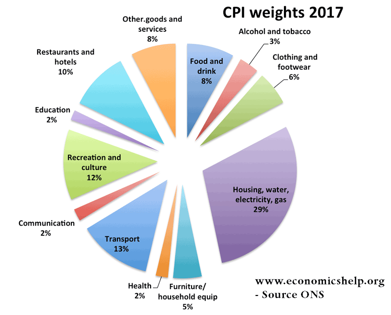
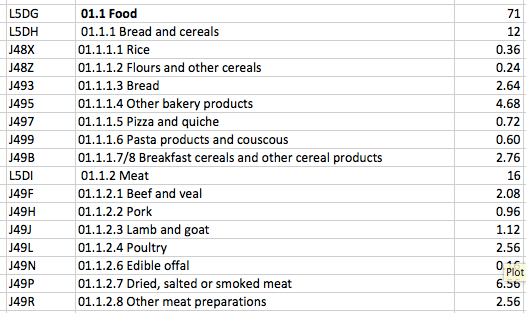
The main categories are then split into different sub-categories. For example Food
source: ONS
One of the biggest weighting in the UK is transport – which accounts for 15% of the total basket.
Within transport, weights are given to different transport modes.

See also: