An examination of UK house price affordability.
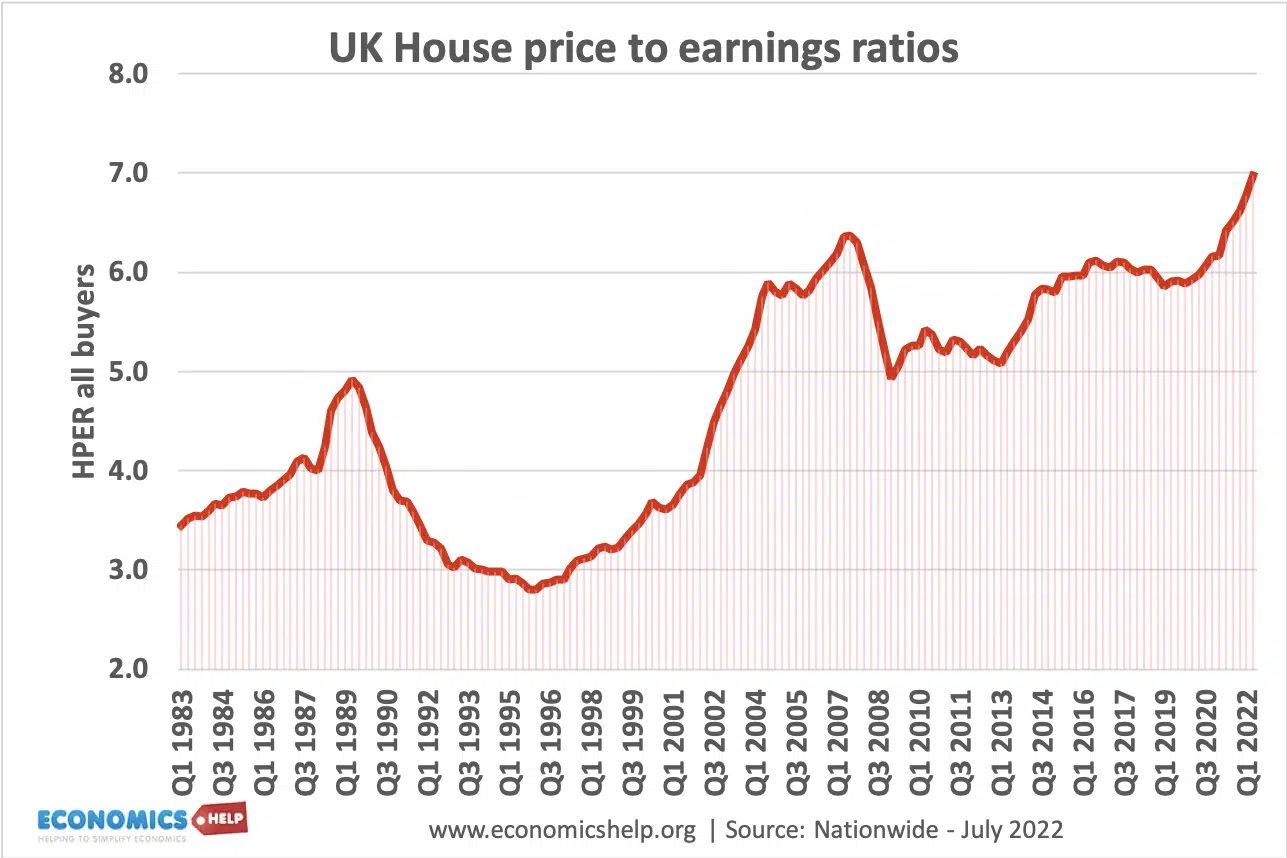
UK House price to earnings ratios (all buyers) reached a peak in 2022. Above the 2009 peak, which preceded the housing price falls.
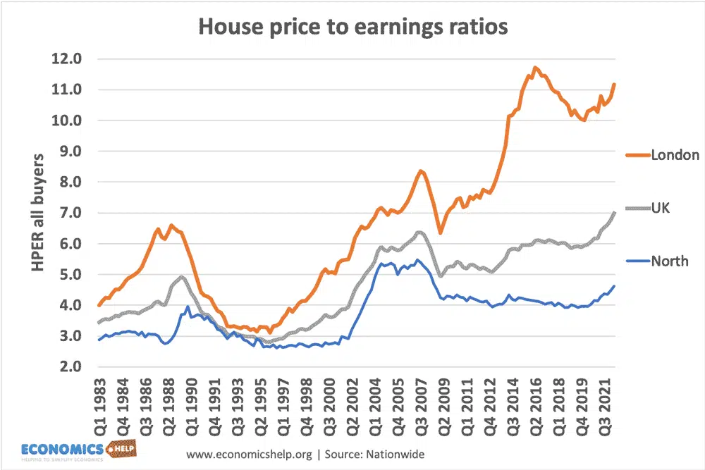
The house price to earnings ratio is most extreme in London, with the ratio reaching 11 times salary. Housing prices in the North, Scotland and Northern Ireland are relatively cheap.
In many parts of the country, potential buyers are being kept out of the market due to house prices being much higher than average incomes. For young people especially, owning a home has become increasingly unrealistic because the deposit required is out of reach for most workers.
UK real house prices since 1975

This shows average house prices – adjusted for inflation. It shows that house prices have risen considerably faster than the average price level.
- The average UK house price was £271,000 in November 2021. ONS
Mortgage payments as % of income
One useful measure of housing affordability is to look at mortgage payments as a percentage of income.
For first time buyers taking on large mortgages, the mortgage payments are still taking up a big % of take-home pay – despite the low-interest rates. The average mortgage payments are lower for average homeowners because many householders took out a mortgage when house prices were cheaper. In this regard, it doesn’t look too bad.
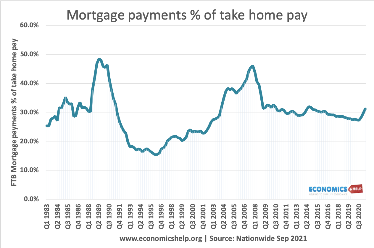
Since interest rates were cut in 2009, mortgage holders have benefitted from low-interest rates, which have made mortgage payments cheaper.
- However, when interest rates rise, many homeowners will see a nasty shock of rapidly rising mortgage payments.
- Also, rising house prices have required a bigger deposit. This means many who might be able to afford mortgage payments are unable to get a mortgage in the first place

UK base rates are starting to rise from historical lows – which will increase the cost of mortgage payments.
The deposit required has risen particularly for first-time buyers. from 10% of purchase price in 1995 to 23% in 2012.
Video on UK Housing market

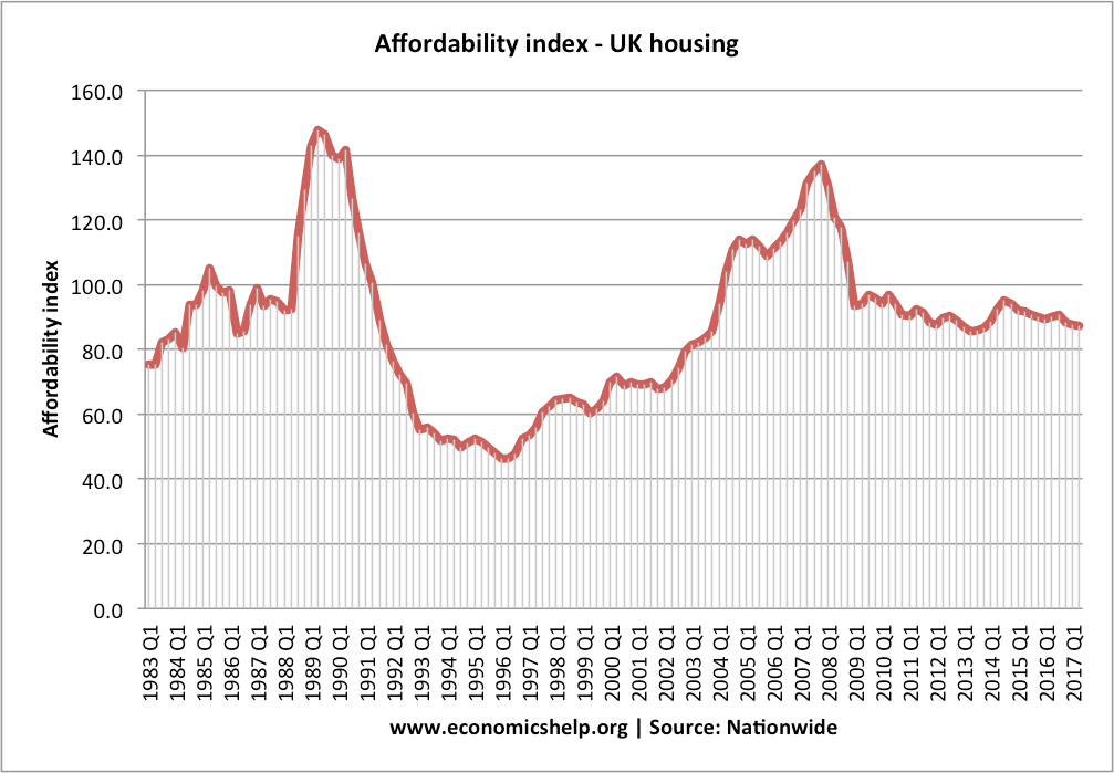
Affordability index
Median income of mortgage borrowers in UK

The graph shows a significant rise in average incomes of those with mortgages.
- In 1990, the proportion of people with mortgages on income of over £50,000 was 2.5%. In 2011, the proportion of mortgages by people with income of over £50,000 was 40%.
- In 2011, only 6.8% of people with mortgages had an income of less than £20,000. In 1990, 61% of people with mortgages had income less than £20,000
- There is a similar drop in the % of mortgages held by people under 30 years of age.
- Source: ONS House price index May 2012
- This data shows average house price to income ratios. It is based on the ONS mortgage survey.
- After peaking at a ratio of over 5.0 in 2007, there has been a surprisingly limited drop in the ratio of average house price to average incomes.
- The graph also shows that the average advance for buying a house has significantly increased. This is one factor in explaining why the average incomes of those with a mortgage have more than doubled in recent years.
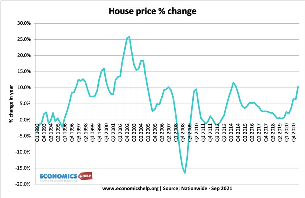
Recent House Price Trends
What explains the lack of Affordability?
1. Lack of Supply. After the credit crunch, house prices in many countries, such as the US and Spain fell dramatically. But, in the UK, the drop in house prices has been more muted. This is because the UK never had a boom in house building like other countries.

Housing completions fell close to 150,000 a year in the aftermath of the financial crisis– well below the level (300,000 government target) needed to meet the growth in the number of households.
See also: Housing supply
2. Relative attractiveness of owning a home. Low-interest rates have meant many homeowners have been able to hold onto their houses. The mortgage repossession rate has remained much lower than in the 1992 recession. The low cost of mortgages makes buying still attractive compared to renting, which is expensive.
3. Demand from abroad. The London property market is marked by strong demand from abroad which has kept prices high, especially on the luxury end of the market. In London, 7 out of 10 homes over £5 million are going to foreign nationals (this is London)
4. Regional Differences First-time buyer ratios are much lower in the north. London ratios are almost twice as high. The housing market has become increasingly marked by regional differences. Property hotspots have seen prices go through the roof, whilst other areas have seen prices stagnate or even fall.
5. Population Growth. The 2021 census showed the fastest rise in the population of England and Wales to 59.6 million. The growth in the number of households is even greater – increasing demand for housing. The number of households in England is projected to grow to 27.5 million in 2033, an increase of 5.8 million (27 percent) compared to 2008. This equates to 232,000 extra households per year. (Household projections 2008-2033 – Data.gov)
Conclusion
If you ask an average young person in the street about the affordability of housing, you are likely to hear strong anecdotal evidence that they are not affordable. For many, buying a house looks increasingly difficult. – at least not without help from parents with the deposit.
Because of ultra low-interest rates, the cost of mortgage payments as a percentage of income looks relatively low. But, since the mid-1990s, house prices have increased substantially more than inflation. It now requires a very high deposit and this is a big barrier to buying a house.
Furthermore, the era of zero interest rates will not last forever.
A startling statistic is the projection of 250,000 extra households a year until 2033. Yet, the UK is only building 150,000 to 200,000 per year.
Further reading
External
- Nationwide house price index – source of data
I love reading your research blog, has anyone published figures for single people living alone, During the 1940s to the 1980s people got married and had families, now it seems there are more people living alone, so the need for more housing has increased or is it because of house prices or wages.
I believe the figure you quote from the census 57m feels like they all live in my area flats are being built on every spare bit of ground, a big proportion cant speak english so did they fill out that complicated census?
Keep them blogs coming i’m learning all the time. David